The Overview report provides a single dashboard from which you can view:
- Real-time bandwidth (Current Bandwidth & Bandwidth Over Time)
- Traffic data (Connections Over Time)
- Purge and load request queue
- Amount of CDN storage space in use.
If a particular platform has not been enabled on your account, then the corresponding graph(s) will not be available from the Overview report.
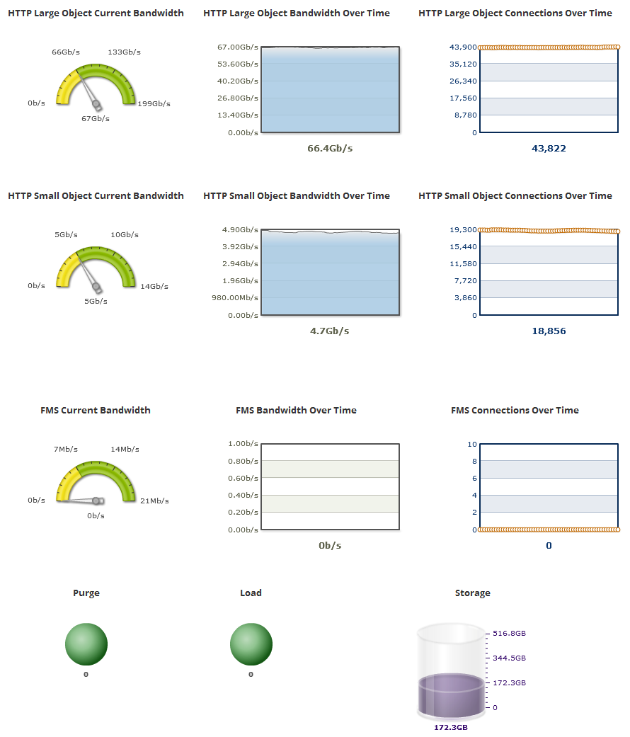
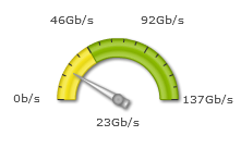
Current Bandwidth
A speedometer indicates current and historical bandwidth usage
The reported amount of bandwidth usage is rounded to the nearest whole number.
The units used to report bandwidth usage varies according to traffic levels. Valid units are: bits per second (b/s), Kilobits per second (Kb/s), Megabits per second (Mb/s), or Gigabits per second (Gb/s).
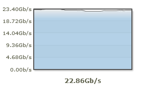
Bandwidth Over Time
The Bandwidth Over Time line graph provides a glimpse into recent bandwidth usage
The units used to report bandwidth usage varies according to traffic levels. Valid units are: bits per second (b/s), Kilobits per second (Kb/s), Megabits per second (Mb/s), or Gigabits per second (Gb/s).
New data on bandwidth usage is made available to this report every five seconds and then plotted on the Bandwidth Over Time line graph. This line graph contains approximately 5 minutes worth of data. This means that data that is older than 5 minutes will be removed from the graph to make room for newer data.
Connections Over Time
The Connections Over Time line graph reports the average number of new connections per second to our CDN service.
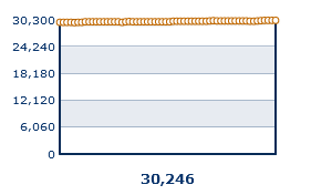
Key information:
- This line graph contains approximately 5 minutes worth of data.
- Data on the number of new connections is plotted every five seconds. Data older than 5 minutes will be removed from the graph to make room for newer data.
-
A user agent's (e.g., web browser) initial request for content will always establish a connection. After which, the user agent determines whether future requests within that session will reuse that connection or whether new connections will be established.
-
This statistic is calculated using the following two steps:
- Each edge server calculates the number of new connections per second over the course of a minute.
- This data is collected from all edge servers and then averaged.
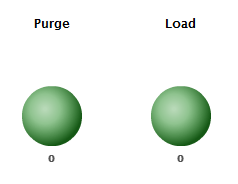
Purge and Load Requests
At the lower-left hand corner of the Overview report, you will find the number of purge and load requests that are in queue to be processed. You can view the exact number of purge/load requests under the respective sphere.
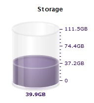
CDN Storage Usage
The amount of CDN storage space being used can be viewed directly below the storage cylinder chart. The shaded portion of the cylinder indicates how much CDN storage space is in use. The portion that appears empty represents the amount of disk space that can be used without incurring overage charges. The exact upper-limit for storage disk space usage without incurring overage charges can be viewed on the upper right-hand side of the cylinder.
CDN storage space usage is calculated once a day. This means that it may not reflect recent changes to your storage account.
Edgecast CDN